

It's the middle of summer, and it's time to enter some competitions. Thanks to Matt Goldman who organized the MAUI UI July.
In this article, we will try to replicate the Ukrainian Monobank mobile application using .NET MAUI. Dribbble design.
Let's start by implementing that beautiful gradient background:
<ContentPage.Background>
	<LinearGradientBrush StartPoint="0,1" EndPoint="1,0">
		<GradientStop Color="#515ca6"
						Offset="0.1" />
		<GradientStop Color="#93767b"
						Offset="1.0" />
	</LinearGradientBrush>
</ContentPage.Background>
The main page of the application consists of only one control - CarouselView.
<CarouselView ItemsSource="{Binding Pages}"
			  CurrentItem="{Binding CurrentPage}"
			  ItemTemplate="{StaticResource PageSelector}"
			  IsBounceEnabled="True"
			  Loop="False"/>
The CarouselView contains 3 items-subpages: Rewards, Main, and Card. Because all subpages have different designs and elements we need to provide different DataTemplates for each item. DataTemplateSelector can help us return the correct DataTemplate depending on the CurrentItem.
public class CardsTemplateSelector : DataTemplateSelector
{
	public DataTemplate Rewards { get; set; }
	public DataTemplate Main { get; set; }
	public DataTemplate Card { get; set; }

	protected override DataTemplate OnSelectTemplate(object currentItem, BindableObject container)
	{
		return currentItem switch
		{
			"1" => Rewards,
			"3" => Card,
			_ => Main,
		};
	}
}
<ContentPage.Resources>
	<local:CardsTemplateSelector x:Key="PageSelector"
		                                     Rewards="{StaticResource RewardsTemplate}"
		                                     Main="{StaticResource MainTemplate}"
		                                     Card="{StaticResource CardTemplate}" />
</ContentPage.Resources>
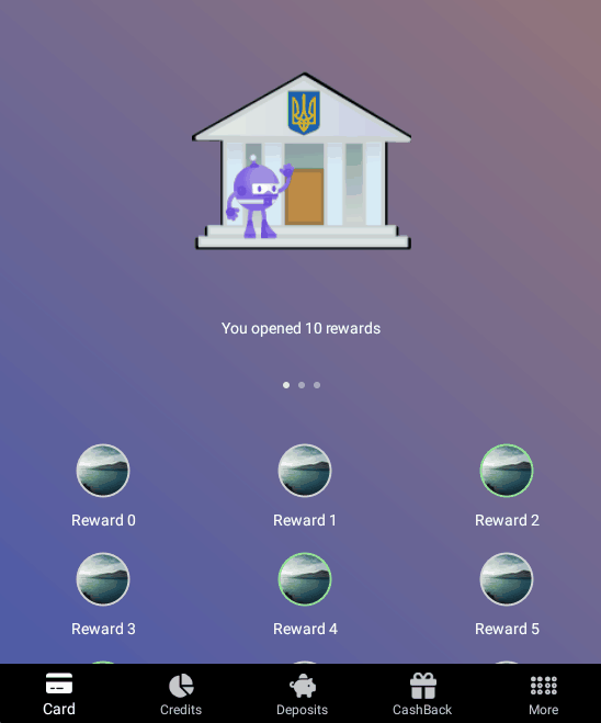
Now we need to create DataTemplate for each page. Let's start with Rewards:
<DataTemplate x:Key="RewardsTemplate">
	<CollectionView ItemsSource="{Binding Source={x:Reference Name=CardsPage},Path=BindingContext.Rewards}"
					x:DataType="models:Reward"
					ItemSizingStrategy="MeasureFirstItem">
		<CollectionView.Header>
			<VerticalStackLayout Spacing="25">
				<Image Source="dotnet_bot.png"
							WidthRequest="200"
							HeightRequest="200"
							Margin="0,50,0,15"/>
				<Label Text="You opened 10 rewards" HorizontalOptions="Center"/>
				<IndicatorView ItemsSource="{Binding Source={x:Reference Name=CardsPage},Path=BindingContext.Pages}"
									Position="0"
									IsEnabled="False"
									HorizontalOptions="Center"
									Margin="0,15,0,30"/>
			</VerticalStackLayout>


		</CollectionView.Header>
		<CollectionView.ItemsLayout>
			<GridItemsLayout Orientation="Vertical"
									Span="3"
									VerticalItemSpacing="20"/>
		</CollectionView.ItemsLayout>
		<CollectionView.ItemTemplate>
			<DataTemplate>
				<VerticalStackLayout Spacing="10">
					<Border Style="{StaticResource RewardStyle}"
								Stroke="{Binding IsAchieved, Converter={StaticResource BoolToColorConverter}}">
						<Image Source="{Binding Image}"
									WidthRequest="50"
									HeightRequest="50"/>
					</Border>
					<Label Text="{Binding Text}"
							HorizontalOptions="Center"/>
				</VerticalStackLayout>
			</DataTemplate>
		</CollectionView.ItemTemplate>
	</CollectionView>
</DataTemplate>

<Style TargetType="Border" x:Key="RewardStyle">
	<Setter Property="Stroke" Value="LightGray"/>
	<Setter Property="Background" Value="Gray"/>
	<Setter Property="StrokeThickness" Value="4"/>
	<Setter Property="WidthRequest" Value="50"/>
	<Setter Property="HeightRequest" Value="50"/>
	<Setter Property="StrokeShape">
		<Setter.Value>
			<Ellipse/>
		</Setter.Value>
	</Setter>
</Style>

<Style TargetType="IndicatorView">
	<Setter Property="IndicatorColor" Value="#ada8c0"/>
</Style>
The page is pretty simple. Please pay attention to CollectionView.ItemSizingStrategy. In our cases, all items have the same size, so we do not need to measure each element in the collection. It improves the performance of the app.
Now we can move on and create MainDataTemplate. This page displays the card balance and transactions list ordered by and grouped by transaction DateTime.
<Style TargetType="Border" x:Key="MainActionsBorderStyle">
	<Setter Property="Stroke" Value="Black"/>
	<Setter Property="Background" Value="Black"/>
	<Setter Property="WidthRequest" Value="75"/>
	<Setter Property="HeightRequest" Value="75"/>
	<Setter Property="StrokeShape">
		<Setter.Value>
			<Ellipse/>
		</Setter.Value>
	</Setter>
</Style>

<Style TargetType="Label" x:Key="MainActionsLabelStyle">
	<Setter Property="FontSize" Value="30"/>
	<Setter Property="Padding" Value="15"/>
	<Setter Property="FontFamily" Value="FASolid"/>
	<Setter Property="HorizontalOptions" Value="Center"/>
	<Setter Property="VerticalOptions" Value="Center"/>
</Style>

<DataTemplate x:Key="MainTemplate">
	<ScrollView>
		<VerticalStackLayout Spacing="25">
			<Label Text="More" HorizontalOptions="Center" Margin="0,20,0,0"/>
			<Label Margin="30,70,30,0">
				<Label.FormattedText>
					<FormattedString>
						<Span Text="1 234" FontSize="50"/>
						<Span Text=".00" FontSize="30"/>
						<Span Text=" $" FontSize="30"/>
					</FormattedString>
				</Label.FormattedText>
			</Label>
			<Grid Margin="30,0,0,0" ColumnDefinitions="110,70" RowDefinitions="*,*">
				<Label Grid.Row="0" Grid.Column="0" Text="Personal money:" />
				<Label Grid.Row="0" Grid.Column="1" HorizontalOptions="End" Text="1234.00$" />
				<Label Grid.Row="1" Grid.Column="0" Text="Credit limit:" />
				<Label Grid.Row="1" Grid.Column="1" HorizontalOptions="End" Text="0.00$"/>
			</Grid>
			<IndicatorView ItemsSource="{Binding Source={x:Reference Name=CardsPage},Path=BindingContext.Pages}"
							Position="1"
							IsEnabled="False"
							HorizontalOptions="Center"
							Margin="0,70,0,20"/>
			<toolkit:UniformItemsLayout>

				<VerticalStackLayout>
					<Border Style="{StaticResource MainActionsBorderStyle}">
						<Label Text="{x:Static fonts:FontAwesomeIcons.Download}"
								Style="{StaticResource MainActionsLabelStyle}"/>
					</Border>
					<Label Text="Transfer money" HorizontalOptions="Center"/>
				</VerticalStackLayout>

				<VerticalStackLayout>
					<Border Style="{StaticResource MainActionsBorderStyle}">
						<Label Text="{x:Static fonts:FontAwesomeIcons.PaperPlane}"
								Style="{StaticResource MainActionsLabelStyle}"/>
					</Border>
					<Label Text="Transfer money" HorizontalOptions="Center"/>
				</VerticalStackLayout>

				<VerticalStackLayout>
					<Border Style="{StaticResource MainActionsBorderStyle}">
						<Label Text="{x:Static fonts:FontAwesomeIcons.SquarePlus}"
								Style="{StaticResource MainActionsLabelStyle}"/>
					</Border>
					<Label Text="Other payments" HorizontalOptions="Center"/>
				</VerticalStackLayout>
			</toolkit:UniformItemsLayout>

			<Grid RowDefinitions="20,*" Margin="0,20,0,0">
				<Border
					Stroke="#1e1e1e"
					Background="#1e1e1e"
					HeightRequest="40"
					VerticalOptions="Start">
					<Border.StrokeShape>
						<RoundRectangle CornerRadius="70,70,0,0"/>
					</Border.StrokeShape>
				</Border>
				<CollectionView ItemsSource="{Binding Source={x:Reference Name=CardsPage},Path=BindingContext.Transactions}"
							Background="#1e1e1e"
							Grid.Row="2"
							IsGrouped="true">
					<CollectionView.Header>
						<Grid Margin="30,0,30,10"
							ColumnDefinitions="*,*,*">
							<Border
								HorizontalOptions="Start"
								Background="#2c2c2c"
								WidthRequest="40"
								HeightRequest="40">
								<Border.StrokeShape>
									<Ellipse/>
								</Border.StrokeShape>
								<Label Text="{x:Static fonts:FontAwesomeIcons.ChartSimple}"
										FontFamily="FASolid"
										Padding="7"
										HorizontalOptions="Center"
										VerticalOptions="Center"/>
							</Border>
							<Label Grid.Column="1" HorizontalOptions="Center" VerticalOptions="Center"  Text="Today"/>
							<Border
								Grid.Column="2"
								HorizontalOptions="End"
								Background="#2c2c2c"
								WidthRequest="40"
								HeightRequest="40">
								<Border.StrokeShape>
									<Ellipse/>
								</Border.StrokeShape>
								<Label Text="{x:Static fonts:FontAwesomeIcons.MagnifyingGlass}"
										FontFamily="FASolid"
										Padding="7"
										HorizontalOptions="Center"
										VerticalOptions="Center"/>
							</Border>
						</Grid>
					</CollectionView.Header>

					<CollectionView.GroupHeaderTemplate>
						<DataTemplate>
							<Grid>
								<Label Text="{Binding Date, StringFormat='{0:dd MMMM yyyy}'}"
										HorizontalOptions="Center"/>
							</Grid>
						</DataTemplate>
					</CollectionView.GroupHeaderTemplate>

					<CollectionView.ItemTemplate>
						<DataTemplate>
							<Grid ColumnDefinitions="50,*,0.2*" RowDefinitions="*,*" Margin="30,10">
								<Label Grid.Row="0" Grid.Column="0" Grid.RowSpan="2"
									Text="{x:Static fonts:FontAwesomeIcons.PaperPlane}"
									FontFamily="FASolid"
									VerticalOptions="Center"
									FontSize="30"/>
								<Label Grid.Row="0" Grid.Column="1" Text="{Binding Name}"/>
								<Label Grid.Row="1" Grid.Column="1" Text="{Binding Description}"/>
								<Label Grid.Row="0" Grid.Column="2" Grid.ColumnSpan="2"
									Text="{Binding Sum}"
									HorizontalOptions="End"
									VerticalOptions="Center"/>
							</Grid>
						</DataTemplate>
					</CollectionView.ItemTemplate>
				</CollectionView>
			</Grid>
		</VerticalStackLayout>
	</ScrollView>

</DataTemplate>
The last page is a Card page:
<DataTemplate x:Key="CardTemplate">
	<ScrollView>
		<VerticalStackLayout>
			<Border Margin="30"
				Background="#1e1e1e">
				<Border.StrokeShape>
					<RoundRectangle CornerRadius="40"/>
				</Border.StrokeShape>

				<Grid ColumnDefinitions="*,*,*,*" RowDefinitions="*,100,*,*,*"
						Padding="30">
					<Label Grid.Row="0" Grid.Column="0" Grid.ColumnSpan="3" Text=".NET MAUI Bank" FontAttributes="Bold" FontSize="18"/>
					<Label Grid.Row="0" Grid.Column="3" Text="UAH" FontAttributes="Bold" FontSize="18" HorizontalOptions="End"/>
					<Label Grid.Row="2" Grid.Column="0" HorizontalOptions="Center" Text="1234" FontAttributes="Bold" FontSize="30" />
					<Label Grid.Row="2" Grid.Column="1" HorizontalOptions="Center" Text="5678" FontAttributes="Bold" FontSize="30" />
					<Label Grid.Row="2" Grid.Column="2" HorizontalOptions="Center" Text="9098" FontAttributes="Bold" FontSize="30" />
					<Label Grid.Row="2" Grid.Column="3" HorizontalOptions="Center" Text="7654" FontAttributes="Bold" FontSize="30" />
					<Label Grid.Row="3" Grid.Column="2" Text="08/29" HorizontalOptions="Center" FontAttributes="Bold" FontSize="25" />
					<Label Grid.Row="4" Grid.Column="4" Text="{x:Static fonts:FontAwesomeIcons.CcMastercard}" HorizontalOptions="End"
						FontAttributes="Bold" FontSize="50"
						FontFamily="FABrands"/>
				</Grid>
			</Border>

			<IndicatorView ItemsSource="{Binding Source={x:Reference Name=CardsPage},Path=BindingContext.Pages}"
							Position="2"
							HorizontalOptions="Center"
							IsEnabled="False"/>

			<Grid ColumnDefinitions="90,*" RowDefinitions="*,*,*" Margin="30,20,30,70">
				<Border Background="#1e1e1e"
						HorizontalOptions="Start"
						HeightRequest="75"
						WidthRequest="75"
						Grid.RowSpan="3">
					<Border.StrokeShape>
						<Ellipse />
					</Border.StrokeShape>
					<Label Text="{x:Static fonts:FontAwesomeIcons.Calendar}" FontFamily="FASolid"
						FontSize="30"
						Padding="15"
						VerticalOptions="Center"
						HorizontalOptions="Center"/>
				</Border>
				<Label Grid.Column="1" Grid.Row="0"  Text="Internet limit per month"/>
				<ProgressBar Grid.Column="1" Grid.Row="1"  Progress="0.5" ProgressColor="Green"
								HeightRequest="30"/>
				<Label Grid.Column="1" Grid.Row="2"
						Text="Left 500$ of 1000$"
						VerticalOptions="End"/>
			</Grid>

			<Border
					Stroke="#1e1e1e"
					Background="#1e1e1e"
					VerticalOptions="Start">
				<Border.StrokeShape>
					<RoundRectangle CornerRadius="30,30,0,0"/>
				</Border.StrokeShape>
				<Grid ColumnDefinitions="50,*"
						RowDefinitions="*,*,*,*"
						Padding="30,20">
					<Label Grid.Row="0" Grid.Column="0" Text="Settings" Grid.ColumnSpan="2"/>
					<Label Grid.Row="1" Grid.Column="0" Grid.RowSpan="2"
							Margin="0,10,0,0"
								Text="{x:Static fonts:FontAwesomeIcons.PaperPlane}"
								FontFamily="FASolid"
								VerticalOptions="Center"/>
					<Label Grid.Row="1" Grid.Column="1" Text="Apple Pay" Margin="0,10,0,0"/>
					<Label Grid.Row="2" Grid.Column="1" Text="Setup skins"/>
				</Grid>
			</Border>
		</VerticalStackLayout>
	</ScrollView>
</DataTemplate>
As a result, you should receive such app:
The full code can be found on GitHub.
Happy coding!