
Hello and welcome back!
Today I am excited to share with you the guide on creating a card stack layout. CardStackLayout displays a list of cards as a stack on the screen. By swiping the top card you can see the next one. Swiping back returns the top card.
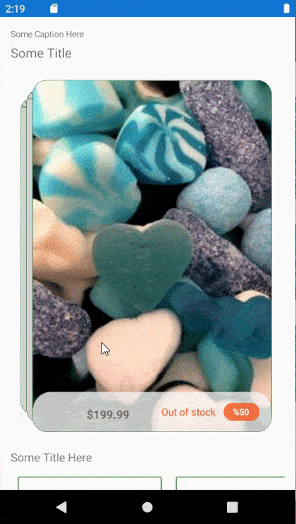
Some popular applications use it like this:

So let's start.
First, we need to create our CardLayout class:
public partial class CardsLayout : Layout, ILayoutManager
{
    public Size ArrangeChildren(Rect rectangle)
    {
        ...
    }

    public Size Measure(double widthConstraint, double heightConstraint)
    {
        ...
    }

    protected override ILayoutManager CreateLayoutManager() => this;
}
ILayoutManager allows overriding the CreateLayoutManager method of a layout to provide a custom implementation of measuring and positioning views. The Measure method takes height and width constraints and is responsible for measuring all of the layout’s children. The ArrangeChildren then sets each view's size and position according to the layout's rules.
We want to achieve a stack effect, so we can see a top card and some part of the cards behind.
Start by implementing Measure method to get control size:
public int Spacing { get; set; } = 5;

public Size Measure(double widthConstraint, double heightConstraint)
{
	double x = Padding.Left;
	double y = Padding.Top;
	double totalWidth = 0;
	double totalHeight = 0;

	foreach (var child in Children)
	{
		x += Spacing;
		widthConstraint -= Spacing;
		var current = child.Measure(widthConstraint, heightConstraint);
		totalWidth = Math.Max(totalWidth, x + current.Width);
		totalHeight = Math.Max(totalHeight, y + current.Height);
	}

	return new Size(totalWidth + Padding.HorizontalThickness, totalHeight + Padding.VerticalThickness);
}
Next step is ArrangeChildren method implementation:
public double CardScaling { get; set; } = 0.8;

public Size ArrangeChildren(Rect rectangle)
{
	int i = Children.Count - 1;
	double x = Padding.Left;
	double y = Padding.Top;

	double totalWidth = 0;
	double totalHeight = 0;
	var maxWidth = Children[^1].DesiredSize.Width;
	var maxHeight = Children[^1].DesiredSize.Height;
	foreach (var child in Children)
	{
		var width = child.DesiredSize.Width;
		var height = child.DesiredSize.Height * Math.Pow(CardScaling, i);
		child.Arrange(new Rect(x,
							y + (maxHeight - height) / 2,
							width,
							height));
		x += Spacing;
		totalWidth = Math.Max(totalWidth, x + width);
		totalHeight = Math.Max(totalHeight, y + height);
		i--;
	}

	return new Size(totalWidth + Padding.HorizontalThickness, totalHeight + Padding.VerticalThickness);
}
In this method we arrange each child into rectangle of size which we defined. For each next child we decrease its height and also change its location. Here we achieved left to right cards direction of card layout.
After defining layout we want to switch between cards by swiping them. We can achieve it using PanGestureRecognizer (Unfortunately SwipeGestureRecognizer doesn't work right now on custom controls):
SwipeDirection swipeDirection;

public CardsLayout()
{
	var panGesture = new PanGestureRecognizer();
	panGesture.PanUpdated += PanGesture_PanUpdated;
	GestureRecognizers.Add(panGesture);
}

private void PanGesture_PanUpdated(object? sender, PanUpdatedEventArgs e)
{
	switch (e.StatusType)
	{
		case GestureStatus.Running:
			HandleTouch(e.TotalX, e.TotalY);
			break;
		case GestureStatus.Completed:
			HandleTouchEnd(swipedDirection);
			break;
	}
}
Now we need to implement HandleTouch and HandleTouchEnd methods:
private readonly Stack<IView> cards = new();

private void HandleTouch(double eTotalX, double eTotalY)
{
	swipedDirection = null;
	const int delta = 50;
	if (eTotalX > delta)
	{
		swipedDirection = SwipeDirection.Right;
	}
	else if (eTotalX < -delta)
	{
		swipedDirection = SwipeDirection.Left;
	}
	else if (eTotalY > delta)
	{
		swipedDirection = SwipeDirection.Down;
	}
	else if (eTotalY < -delta)
	{
		swipedDirection = SwipeDirection.Up;
	}
}

private void HandleTouchEnd(SwipeDirection? swiped)
{
	if (swiped == null)
	{
		return;
	}

	switch (swiped)
	{
		case SwipeDirection.Right when Children.Count > 0:
			cards.Push(Children[^1]);
			Children.RemoveAt(Children.Count - 1);
			break;
		case SwipeDirection.Left when cards.Count > 0:
			Children.Add(cards.Pop());
			break;
	}
}
Now, when you swipe from left to right the top card will disappear. Swiping from right to left will return swiped card to the top.
As a result, you should receive such app:
The full code with different layouts and swipe directions can be found on GitHub.
Happy coding!